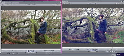
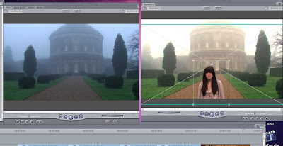
I have taken a couple of screenshots so that these subtle details can actually be seen to have been a conscious effort on our part, rather than just an accident! We have also added a subtle sepia tone to the autumn shots, and a pink to the spring shots, to emphasise the change in seasons, although the transition is quite subtle.
A new edit that has been made this past week (as thought of by Roisin, who has been having a lot of good ideas recently!), which was to add a split screen during one of the instrumental sections of the song. The 'random' sections were looking a bit dull, and we all agreed, particularly after Gemma's audience feedback, where people commented that these sections looked like 'slideshows of trees'. Roisin had the idea of changing the random shots to shots of Amy playing the piano, like we have at the start of the song, and then she also thought of having a four way split screen. To start with it looked a bit odd, and it didn't really 'go' with the rest of the video, but then we thought of having another four way screen at the very end of the video, to bring together the 'seasons' theme. When we finally did all of this, it actually looked really good, and we are all much more pleased with the finished result than we were before.
 So this is a shot from the 'winter' verse, and whilst the shots looked amazing before we did anything to them, we all agreed that the greens were far too prominent to really represent the winter season, and so what I did was too un-balance the colour, and make the shadows in the clip 100% blue, rather than 50%. What this did is to just make the shot look a lot 'colder', but without being too extreme.
 This was what we did in today's lesson. Whilst we had done the colour alteration previously, none of us were too happy with the way that the shots flickered when they cut between eachother. This was where Roisin's genius idea number two for today came in! She suggested that we have one still shot of the house through the wholse verse, and then crop the sections where Amy moves over the top . This proved to be a fantastic idea, as it worked very, very well for the final shot. It was suggested that we reshoot that one shot so the transition would be smoother. What was brilliant was that we could move the cropped shot around and so it was smooth! Yippee!

Great work in colour correction/manipulation here. The time spent pays off. These beforeand after shots will comeinhandy for the evaluation task too (as discussed). Great job team Reflect! :)
ReplyDelete