Tuesday, 8 March 2011

Evaluation

Untitled from Rachel Seymour on Vimeo.

Here is the final evaluation of our product. It is quite long, but if you have time, please watch it and tell us what you think!

The Finished Video

Below is our final music video, all finished! Sorry about the quality, but we will try and upload a HD version at some point, especially since we went to all the effort of filming it in HD! Also, we seem to be having a few issues with copyright (WMG seem to be very quick at finding copies of 'Us' by Regina Spektor on You Tube!), so if YouTube fails to work, I will try Vimeo afterwards


So, YouTube has disabled the audio track, literally seconds after I uploaded the video, so I will try Vimeo now (but leave the YouTube link up so you can see the efforts we are going to!)


A2 Media Production from Rachel Seymour on Vimeo.

Thursday, 17 February 2011

Lasts night editing

Well last night, I stayed after school for another 2 and a half hours. These hours made me realise that we still did have a lot to do to make it as interesting as our last years commentary. I managed to nearly complete question 3 as I just needed to get a few more pictures from the Internet, and it gave me the opportunity to get roughly over a third edited in question 4. Staying behind last night was the right decision because, it gave Rachel and Roisin more time to edit their questions. Also, at lunch we were meant to be doing some more editing, however, the other year 13 group was in there so, unfortunately, again, we were unable to do anything.

However, I am extremely happily with the process made and very grateful that we have an extended deadline so we have a couple more extra days. I am also extremely happy that I have been able to get my teeth stuck in to editing process of our evaluation. I feel that if we can have spend a few extra more hours on the computer, we will be able to make an evaluation that we are all pleased off.

Wednesday, 16 February 2011

Webpage Finished

Here is the Webpage finally finished! (Just click on the link below)

http://www.wix.com/roisinryann/rrgj_reginaspektor

Wix

For me, creating a webpage using Wix was a very enjoyable task, despite it taking up a lot of time. I've worked really hard trying to perfect it and ensure the synergy of all aspects of our final product are apparent within the webpage and hope I have been successful. Just as Rachel with editing and Gemma and Jade on the Digipack, I feel we have all played to our strengths well!!

Wix is a great way of creating a flash website that's user friendly, easy to use and free! Because it is flash based, for me owning a mac and when Rachel and I were working on a Windows computer, it was extremely fast whilst editing.


Today's evaluation editing plan

So today, we arranged to do many hours of editing as we really are committed to making that deadline tomorrow. We planned that in the free and lunch time, we would spent the lesson editing and stay behind after school as well to try and get as much done as possible.

Well, at break time we went in room 101 to get loaded up and we found that it was already being used by the other year 13 group. We then had to have a word with them about what we are going to do. This is because, they have had the computer for the past two days, so we all felt that we needed some good quality time on there. Therefore, we spent second period and lunchtime editing. In these two time gaps we put in order and cut all our speaking parts so now that we just need to make it more interesting by using screen shots and show evidence of what we are talking about.

We have also arranged that tomorrow, the other year 13 group will be working on their evaluation during second period and we will be working on ours during lunch time.

The deadline is coming up very quickly and we are all feeling the pressure, which can be seen by our friends. Hopefully, with the computer sharing now in plan, it is looking better that we will meet the deadline. However, Rachel and Roisin still have some speeches to film and we are going to film all four of us for the beginning and the ending. We also need to upload some of our footage again as some cant be found.

With this check list still in our mind, I am staying after school tonight to try and get the missing footage uploaded again and to start putting in our evidence. I may start our menu for our disk too, however, I am not sure on that yet. Just in case we haven't uploaded to the disk yet by the end of tomorrows school day, Jade and myself have made ourselves free to get this finished off and make it something we are proud of and worth all the stress that came with it.

Tuesday, 15 February 2011

The final digipack

This is our final digipack is a view on the net. We worked very hard on this and we hope that you all like it.


Trouble that may effect the deadline

As it has been drilled into our heads several of times, that our deadline is this Thursday. With only a very short amount of time to do our evaluation, we created a plan of splitting the questions up to help us reach this deadline. However, no one in our group thought about the situation with the computer.

We are currently sharing a mac computer with another year 13 group who are also working towards the same, tight deadline. This means that both groups are fighting for the same computer. Over the past couple of days, Jade and myself have planned to go and get a head start on editing, however, the computer has been in use. This means that we are going to need some sort of system so that both us and the other media group, get the same amount of time use for the computer, as this is the only way we can all have a chance of finishing for the deadline.

To help us near completion, we are all giving up some of our free time and I, along with others if they don't mind, maybe staying late after school on Wednesday so we wont have to rush the editing during the lunch hour.

Evaluation editing

So today's lesson, we uploaded mine and Jades questions, the audience feedback and what Rachel and Roisin had filmed so far. This took all lesson so unfortunately not much editing got done. However, I did find out that as we filmed all the questions without stopping the camera recording so it all came out in one clip, it wont actually take that long to find the parts we need and edit out what we don't need. This is very good news as we were worried that it would take a long time. But with little time to achieve a full evaluation, it is nice to hear, that finding the extracts that are needed, will be easier than expected.

News about the digipack


This is an email from Quadraproof explaining that they made an mistake saying that they could print our digipack as they didn't realise completely how big it was. They then went on to explain that to print this size, it will cost around £60. After discussing this with Roisin and Rachel (as unfortunately we were missing Jade today due to a art trip), we decided that we were not willing to pay that much. To see if we can get a printed, we are going to see if the art department can print it in A3 for us.

Planning Parts 1 and 2 of our Evaluation

So, Roisin and I are in charge of parts 1 and 2 of the evaluation, which are:
  • In what ways does your media product use, develop or challenge forms and conventions of real media products?
  • How effective is the combination of your main product and ancillary texts?
We have decided to plan and script most of the answers to the sub-questions that we have. We also made a storyboard of how our section of the evaluation will look, so all we need to do now pretty much is actually film it and then add all the effects and stuff and basically make it look great! So below are the roughly drawn up scripts that Roisin and I will be using to film tomorrow, as well as the storyboards that we drew up last week.


Monday, 14 February 2011

Digipack


Here are some pack shots of our digipack. This isn't the final digipack, just the first draft, as it is a miniature version of what will hopefully be a really cool CD case in the end! However, what we have here is enough for the mark scheme, but it will be nice to have a finished, proper version for ourselves!
We all agree that it looks really good, the pictures are really effective and it looks really professional!

Starting our Evaluation

After planning and briefly scripting the answers to questions 3 and 4 on Friday, Gemma and I decided to set about filming the sections of the evaluation we appear in. Differing from last year, the group has chosen to 'split' the evaluation in half as such. This is because we have a much shorter timescale than before, and deligating particular sections will help us condense ideas and take on multiple roles, eg, we are able to have one part of the group capturing footage whilst the others upload or edit.
Also changing from last year is our use of scripting. Both Gemma and I decided to opt for a looser script with more improvisation as we think this will look less artificial and more natural on screen. This was a risky move (considering our track record of delievering lines to a camera!) but amazingly, we managed to cover all of our filming requirements in the first lesson meaning we are bang on schedual.
Once Roisin and Rachel have shot all of their footage too, we plan to sit together as a collective and pool all of our energy into editing it together; we have all of the materials to hand on the imacs so it simply is the construction that is going to be the most time consuming.

Friday, 11 February 2011

Some very good news

Today we received some very good news. Quandraproof, the digipack company in which Ceri suggested to us, answered the email which I sent to them yesterday and said that they will happily print us off a copy and only for a small fee.

This pleased us all as we were very worried that if we were able to get it printed, it would cost too much. With printing with this company, they did say that they couldn't print it on photo paper as when folding it up? It wouldn't work. Therefore, they said that they would kindly print it off on card for us and even print off a couple extra copies just in case there becomes problems while folding, however, they did mention that we will have to fold it ourselves.

However, we are all extremely pleased with the offer we have been made and we are very excited to see the final product.

Evaluation

After splitting the questions between us, it meant we have more of a chance to finish everything buy the deadline. The questions Jade and myself had to concentrate on were:

3. What have you learned from your audience feedback?
4. How did you use media technologies in the construction and research, planning and evaluation stages?

Me and Jade, took a similar but different strategies to Rachel and Roisin. Similar to them, during one study, Jade and myself wrote down bullet points in which we really wanted to mention. However, we didn’t right a speech on what to exactly say. This is because we felt that we could come up with a better speech on the spot than planning it in advance. Also, this meant that we could definitely be able to film on Monday and be ready to edit as soon as possible. Here are pictures of the plans we made for each question;

Thursday, 10 February 2011

Printing the digipack

Today, we finished our digipack which we are all very proud of. To fulfil what we have to so in the specification, what we have achieved so far, is fine. However, after spending so much time concentrating on it, we all agreed that, to feel fully satisfied with it, we are going to print it out. However, using the schools equipment, we can only print it onto a A4 piece of paper. Even though, this size, the digipack comes out very cute, we could quite like to print it out to actual size.

To print it out to actual size, we need to go to a professional. After phoning many different numbers, we got different quotes, ranging from £21 to £50. Luckily Ceri knows someone who maybe able to print it out for us so I am sending them a copy of the digipack and they contact me with prices and whether they will be able to do it or not. So fingers cross that it all goes to plan.

Friday, 4 February 2011

Our digipack...

Working today first period and lunchtime solely on our digipack, it is now taking shape. And, even if I do say myself, I feel that it is looking impressive and convincing as a digipack. Here are some of pictures and a step by step of what we looked like.

Firstly is the winter season:


On this picture, around Amy, there was a pink blanket. We then took colours from the grass, placed on top of the blanket and blurred it into the grass. This then makes Amy stand out more and makes the blanket disappear.

We then went across making a lyrics page. For this we took a photo that we all loved but we had to make sure that Amy was too one side so there will be room for all the lyrics. We then wrote up all the lyrics. An issue with with the front cover was the idea that the black writing was too heavy. We needed to then address this issue with the lyrics, but we couldn't use the colours grey or white. However, looking with the writing black, it doesn't look too heavy because it pulls out her tights.


We first drafted our front cover using this photo, however, we have now gone for more of a conventional front cover. We are now using this as our back cover. We have added in a bar code on to make it seem more realistic as this means it can brought in a shop. We then wrote our website on as this makes the clear link between the digipack and the website. We then wrote the small information in the bottom of the corner about the production company and every ones name that was involved in the making of the music video, the digipack and the website.


The thank you page in a digipack is very very common so we knew we would have to include on. We took the first picture below of Amy sitting on the stairs, cut the side off but in cutting it the shape of the stairs, and finally blurring it into the black to the side. We then started writing the thank you note. Deciding what to write wasn't hard as the three main topics in which artists write about are their family, their companies who signed them/help them and then they thank their fans, so this is what we decided to write in ours. Finally, to put the finishing touch on, we added a few butterflies as this has become a common aspect in our digipack and website.


Putting these photos all together and many more on to our multi-cross digipack, this is what we came up with:
As you can see, it is not completely finished, however, the major aspects are complete and it shouldn't now take more the another lesson or lunch time to finish it. This will then mean, it is one more product that we wont have to think about anymore.

Thursday, 3 February 2011

The Front Cover...

From Gemma's research it is clear to see that an image presenting a close-up/extreme close-up of the artist is VERY conventional of a female performer and this got us considering our cover. Seriously reviewing our draft (the image of Amy perched on the stone wall, surrounded by fog saturated fields), we also identified that the components looked somewhat lost in the image and didn't quite gel together how we had planned. It is a beautiful photograph which we think will better frame the 'admin information' (barcode, record label, copyright etc) needed to achieve a realistic and viable finish in a more visually pleasing manner. Therefore, we intend to shift this image to the back page of our digipak and replace it with a still from the music video itself. Throughout the process of construction each of us had swooned and gushed at how much we loved this particular frame (depicting a close-up of Amy resting her head against a tree - Autumn section) but it had never occured to us to actually use it in our digipak! This in turn strengthens the link between the two products as the viewer is able to identify and recognise certain reacurring images.

The Maltese Cross

http://www.discwizards.com/templates/digiPakMalteseCross-DW.pdf

Today we decided to opt for the Maltese Cross template for our digipak (the link to which is above).
We feel that this layout will present our photographs in the most asthetically pleasing way; looking compact and contained rather than spaced out and loose. The way in which the digipak will open and close also captured our interest as it mimics the unique and individualist streak in both our artist and target audience; setting us apart from the rest of the market.
Additionally, the shape and movement of the piece could be likened to that of a flower, again realting to femininity and the unusual.
We have also narrowed our choices of photographs down and planned where each image and section of text will go on the pages; therefore the elements of decision-making needed tomorrow will be minimal - it is merely a case of 'cutting-and-sticking' into shape.
We have made a conscious effort to leave the photographs as untouched as possible, as we want the natural elements to shine through rather than be smothered with artificial effects.
Any post-production has been kept soft and relatively light. We chose the font type specifically to keep the overall image fresh, clean and simple, therefore preserving the natural theme.
I also decided to experiment with layering butterflies in an applique style onto some images that needed a 'boost'. I think this has worked extremely well (much better than I imagined!). As well as giving the pages of our digipak a textural depth, they have also adopted a quirky, organic atmosphere which parallels with our target audience/artist beautifully.

The front cover for our digipack

Here is a draft of the front cover for digipack:


After getting some audience feedback, they commented on our daft. They came up with a few comments which were really fair. The main comment was the fact that 'Us' doesn't stand out and looks more like a album cover. This is a good comment because, when deciding what to do with the cover, Jade and myself both said that the title needed to stand out more, however, were worried it would look odd. After doing some research into female artists signal covers, it turns out that many do use different fonts.


As you can see, with the exception of Cheryl Cole's cover, they all have different fonts. This means that, as a group, we will talk about what to do with this.

The next stage of making this front cover was the font we were going to use. We tried out many different fonts to show a variety. However, the font used at the moment is a draft because now, looking back at it, the font is very heavy while the picture of Amy and the butterflies are very light. To solve this, we are either going to change the font to make it look lighter or change the font colour or change where the butterflies are to even the cover out.
The butterflies are now a symbol that we are going to use throughout the digipack and the website. These butterflies came about as when we were filming in the house for the inside scenes, they had butterflies on display and we took a photo of them. After we photoshop them out, we added them on to our photo. This is how they first looked and after we cut them out.


The photo used was a big decision. We liked this photo it is a naturally beautiful picture, whereas many other photos would need work doing to it and may look plastic. This is not the look we wanted because we are aiming our music video to an audience to show that simple things are more beautiful than plastic aspects. However, looking more closely at the single photo covers above, most of them are more of a close up than a long shot. Deciding whether to follow the close up conventions or break this trend, we are now voting which photo to use.

Wednesday, 2 February 2011

The Digipak...Construction

As we near the deadline, our ancillary texts are well on their way to being finished.
This week, Gemma and I shortlisted a collection of photographs which will be used in our digipak and website (to keep both visually in-sync with each other). They represent each of the main components/locations we used (spring, summer, autumn, winter, 'inside') and so futher highlight this theme of change in the music video itself.
The bulk of the post-production work on the professional shots has now been completed and we are ready to begin layering text (lyrics, 'admin' information, personal message from Regina, credits etc) and start slotting them into place.
Tonight I plan to sketch out a variety of possibilities in order to give the group more material so we can make an informed decision about which digipak would best convey our theme, artist and target audience (having a clear plan will also make the final construction stage much less daunting as it reduces the risk of becoming 'lost' in the computer screen!).
For the structure of the digipak itself, we have decided to focus on two main contenders; The 4 panel template and the Maltese Cross template. Both would accomodate our selection of photographs and amount of text we wish to use, so the final decision will be made along the lines of asthetic quality and audience preference.

Tuesday, 1 February 2011

The Webpage so far...


Here are some screenshots of the webpage so far. I was going to publish it and then post a link, but I wasn't sure if we could edit after that, so I thought it was safest to just do it this way, as Roisin and the rest of the group haven't seen this yet. Also, as you can see, the video we have used on the webpage is in fact, the original video, which we don't want to use!
Anyway, just thought I would keep everyone updated with how its all going! Any comments would be greatly appreciated!

Monday's lesson

Unfortunately, I haven't be able to attend today's lesson due to being ill. But i though i would quickly just inform you about what happened in Monday's lesson. Rachel and Roisin went to work on the web page and Jade and myself carried on with the digipack.

Using photoshop is a very long process which can easily frustrate you. However, even small changes can make a big difference. We proceeded with creating the front cover today. At the end of the lesson, we showed the others and they said they liked it but Jade and myself think they were just being polite. We will sit down and talk about it as, even though we are concentrating on different aspects of the coursework now, we are still a team and we all need to like everything and, we all need to make changes to make sure that all 4 of us are completely happy with the final product.What has been accomplished so far are drafts and nothing is set in stone yet, until we are all happy with it.

I am looking forward to see what the web page looks like so far.

Friday, 28 January 2011

The Digipak and webpage

Looking at our timescale, we decided to split the responsibility of the ancillary tasks in order to ensure both are completed to the highest limits of our ability. After reviewing our individual strengths and interests we came to the conclusion that Roisin and Rachel would take a more prominant role in the webpage production whilst myself and Gemma would manage the digipak.
Obviously the whole group will frequently refer and review each others progress to build a strong theme and motif that will closely tie the three products together.

Done and Dusted...almost!

Finally, I think it's safe to say our music video is nearing the very edge of completion! After watching it multiple times last lesson we confirmed that the main body of the video has really taken shape and is working together with our target audience and themes well. Only minimal amounts of editing are now needed in order to satisfy our collective perfectionist mentality; and most of that is focused on detail and asthetic qualities such as colour manipulation and cropping out imperfections in certain frames, so will not take more than one more lesson. Therefore, our attention can now shift to the construction of our webpage and digipak which are due a week from today.

Thursday, 27 January 2011

Editing!

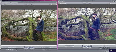
So today we were doing some final touches to the editing and I thought that I should put some of the 'before and after' shots to show what we have done in post-production. Most of the editing we have done is quite subtle, and although the shot below on the right looks very blue, when the whole video is played, most people do not even notice the colour work we have done.

I have taken a couple of screenshots so that these subtle details can actually be seen to have been a conscious effort on our part, rather than just an accident! We have also added a subtle sepia tone to the autumn shots, and a pink to the spring shots, to emphasise the change in seasons, although the transition is quite subtle.

A new edit that has been made this past week (as thought of by Roisin, who has been having a lot of good ideas recently!), which was to add a split screen during one of the instrumental sections of the song. The 'random' sections were looking a bit dull, and we all agreed, particularly after Gemma's audience feedback, where people commented that these sections looked like 'slideshows of trees'. Roisin had the idea of changing the random shots to shots of Amy playing the piano, like we have at the start of the song, and then she also thought of having a four way split screen. To start with it looked a bit odd, and it didn't really 'go' with the rest of the video, but then we thought of having another four way screen at the very end of the video, to bring together the 'seasons' theme. When we finally did all of this, it actually looked really good, and we are all much more pleased with the finished result than we were before.

So this is a shot from the 'winter' verse, and whilst the shots looked amazing before we did anything to them, we all agreed that the greens were far too prominent to really represent the winter season, and so what I did was too un-balance the colour, and make the shadows in the clip 100% blue, rather than 50%. What this did is to just make the shot look a lot 'colder', but without being too extreme.
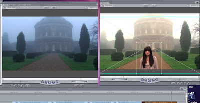
This was what we did in today's lesson. Whilst we had done the colour alteration previously, none of us were too happy with the way that the shots flickered when they cut between eachother. This was where Roisin's genius idea number two for today came in! She suggested that we have one still shot of the house through the wholse verse, and then crop the sections where Amy moves over the top . This proved to be a fantastic idea, as it worked very, very well for the final shot. It was suggested that we reshoot that one shot so the transition would be smoother. What was brilliant was that we could move the cropped shot around and so it was smooth! Yippee!

Tuesday, 25 January 2011

Today's lesson

In today's lesson, Jade and myself carried on with photoshop on a winter picture, while Rachel and Roisin carried on with a little bit of editing. Overall, from a distance, both projects looked no different from when we walked in. However, we were all working on fine details and this are the parts that are going to take these projects from good to brilliant. Here are some production shots of what happened today.


Monday, 24 January 2011

Photoshop

Today, we had a quick lesson on the basic on how to use this programme. Finding it difficult at first, we spent time away from editing, to develop these skills and be able to work this programme with confidence and to no longer be scared of it.

To get a head start of our digipack, Jade and myself started on our favourite winter picture. In this photo, there is a pink blanket showing as our actor needed something to sit on. We then learnt that we can paint over this in different greens to match the grass, and then we are blurring the background so it will blend in nicely but to draw more focus to Amy. This is our plan and so far it is going OK but fingers crossed we can continue this through out this picture and come up with more creative ideas for the rest of the other photos.

Wednesday, 19 January 2011

Editing Update

As I'm sure that everyone is aware, we have been concentrating mainly on editing our video these past few weeks, and most of our group have given up lunch times and study periods so that we can get as much editing done before the deadline in a few weeks, and still have time to do a good job with our ancillary tasks.
Anyway, it all seems to be going quite well, and we will try and keep you updated on what is going on!

Today was an early start

After arriving at school early today (25 past 8 to be precise), I decided to go and get a head start on the day to look closely at certain sections of our music video. What I found was, a section of some of the random shots were completely off the beat. As this was annoying me,i decided to cut them to make them o the beat. However, I did not feel like I should then delete the shots and start again with extending the others because, this is a groups project and we all need to make that decision together, but the shots are cut in the beat ready for the rest of the group to look at it tomorrow.

Some research

As we are now nearing the start of the digipak and website creation, I thought I would to some research into the codes and conventions, so we all will have a clear understanding of what we have to have in these products. This research will help create a professional and realistic representation of the digipak and a website.

Digipak

~ Visuals are key to the production - Includes images of the artist/band, shots from concerts, instruments, etc.
~ Band/artist name and album title, making the brand easily identified. Can be included along the spine and on main cover.
~ List of songs included, with lyrics.
~ Basic information about the artist/band - background information, type of music, etc.
~ Reviews from newspapers - Good reviews are often printed on the back cover to encourage sales and marketing.
~ General thank you notes from artist/band

Website

With a website there are many aspects that you accept to see. There with be the brand logo, pictures, clips of the band/artist, tour dates, release dates, updates, interviews, and many more. These websites from the artists are there to keep the audience informed about every thing they do and every thing about them. Overall, these websites are also used as a marketing technique.

Some more Audience Feedback

Today, after seeing the mixed reactions in the previous audience feedback, Roisin and I decided to do some more feedback with a different sample group. We asked 8 people - 4 boys and 4 girls so that we had a mixed-gender viewpoint. We definitely noticed a difference between the male and female opinions, which is good in a way, as we actively aimed our product at women.

Here is some of the feedback that we received:
  • The sweeping round the piano shot was good
  • The robin and other random shots were good
  • Some people thought the camera flash in the Spring section looked cheesy, but more people thought that it looked good
  • Some people said that we filmed on a good day for the weather, and that they liked the 'misty-ness' of the shots
  • The 'random' nature shots many people liked as well
  • Most people liked how the random shots changed with the music (on the beat - most people thought that the visuals and music went together very well)
We also decided to ask about some of the issues that the previous audience feedback raised, so as to see if the opinions given were thought by everyone, or just the people that Gemma asked. Most people said that if they saw it on a music channel, then it wouldn't look out of place, which is a good thing, and one person even said that it reminded them of a video by Ellie Goulding. Her music is of a similar style to Regina Spektor, so it is good that one of our respondees could see this link, as it means that this video will appeal to our target audience. I have attached a link to the video by Ellie Goulding, and having watched it, I can definitely see the resemblance (except I think the mist in her video is intentional!).


Once again showing the difference between our target audience - women - and men, none of the boys we asked even noticed the costume changes, whereas all of the girls saw and commented on it. This is a good thing, as when we were planning this video, we decided to aim it at women by doing things such as costume changes. One thing that I don't personally see as a problem, but others might, is that nobody in the group immediately spotted the 'seasons' theme, but they could see it after we pointed it out. However, we all agreed as a group that a performance based music video would be easier, and a theme of 'seasons' will always be more thematic than narrative.

Anyway, overall, everyone in the audience thought that it was a very good, professional video (we even got a round of applause when it finished!) and they really struggled to think of anything that we could improve. It was also quite nice to have a group of people who didn't take media studies (none of them at all), as we could get a completely novel point of view compared to our own media-filled brains.

Just a quick look-in...

Hello blogger I have missed you dearly!
So as you already know I've been quite ill as of late which has meant my involvement in the editing has been annoyingly curtailed. My group have responded brilliantly though and despite being a member down, have really pulled together in producing a slick product. I can happily report I am now well on the mend so will be diving head-first into the production of the digipack and webpage very soon. To make up for my absence in a large part of the editing stage, I hope to take a more prominant role in the ancillary tasks (as long as that is ok with everyone else of course!); especially regarding the digipack as 2D design is were my creative strength lies.
Thankyou team for updating me and being such magnificent stars!

Tuesday, 18 January 2011

Audience feedback

Yesterday lunchtime, I took the chance to do our first audience feedback as this will help us no whether we are on the right track with our music video or not. Altogether there were 10 people watching our video (6 boys and 4 girls). I asked them 4 questions to get a inside of what they really thought about our music video.

Question 1: What did you like?
- Scenery was good, large variety
- Location
- The quality of the video was awesome
- Shots of the scenery
- Different shots of Ickworth
- The filming
- The footage
- Good quality, filming of individual shots
- Good steady filming, good mixture of scenes
- Lip syncing, environment shots, filming good, looks professional

Question 2: What didn't you like?
- Part of the video was like slide show of trees
- The song
- Music
- Some shots were to sharp - looked like a slide show
- Scene changes not on the beat - is this intentional?
- The girl pretending to sing with the lyrics is off beat
- Too long 'slide show' bit
- The random shots - why sheep?
- Too many images - more moving shots needed in between still shots

Question 3: What would you change/improve?
- Use less pictures of trees
- More movement
- Less slide shots
- Less snappy shots
- Get rid of the side show/change it
- Less slide show and needs a storyline
- Less slide show and make singing en-sync
- Get rid of random shots as there is far too many of them
- Get the video to be less random
- Keep it on one day as the seasons are not clear at all

Question 4: Is this a video that you would expect to see on a music channel? Why?
- Yes, good variety of scenery
- No, there was a slow pace to it and not many advanced things
- Yes, good quality filming
- Yes, girl singing
- No, it's too random and not a good song
- Not sure as don't watch them much but I think it is too random to pass as a really music video
- Possibly, quite good
- Yes, good quality of filming
- Yes, good mixture of scenes but the song wouldn't make the charts
- Yes, but the song is too bad to make it back

Now to comment on a few of these comments:
- Bad points about the song came up in nearly every bodies comments. From starting off we knew that this would be a problem. We knew this because before deciding which song we were actually going to do, we did an audience research and only 2 people said they liked this song. However, when you are working in a group of 4, you have to take into account what everybody likes and you have to give and take factors so everyone will be pleased. Rachel and Roisin were very excited about this song, but myself and Jade wanted to do another song, however, we all made scarifies to be able to work in the group.
- The quality of the filming came up a few and we would like to say thank you to the HD camera for that.
- The 'slide show' came up many of times and a lot of people said we should change this. After discussing its with the rest of the group, we all felt that this was a fair comment and we total agree them. We are planning on changing the shots around so it will feel more like a music video. Along with this, we will be going though the video with a fine tooth brush to make sure that every signal location is on the beat of the music.
- The scenery also came up a lot as they all agreed that we choose a beautiful location and it fitted in well. We were lucky to find this location as it never completely crossed all of our minds.
- The last important comment was the fact that someone said that the season weren't clear. This was an important issue for us as this is our main narrative in our music video. We need this narrative to work out because two of us wanted a narrative based video and two wouldn't more of a random based video. This means that if the narrative didn't work out, then two of our group wouldn't have their vision in the video as much as the other two. To work this problem out, we are going to use some tint over the seasons to make the seasons clearer. Making the seasons clearer ill also solve the problems people had about the video being too random and not having a story.

A little update for Jade

Unfortunately Jade has been very ill recently so as we all no she is very organised, I thought I would quickly update her with what has happened in her absence.

On Monday we went through and tried to put all the random shots to the beat and change a few things to make some shots seem less random. I also informed them about the clock shot in black and white that you weren't to keen on and we changed the after shot. However, this isn't final and we said that if you don't still like it then we will change it. I hope this is OK. Also, I did an audience research that we planned to do on Monday without you and I will be posting the results later tonight.

Today, we took notice of the feedback given and we changed some of the shots. We started putting tint over the seasons to make them more clear.

When you are feeling better, we would love to hear your comments of what we have changed and then we will talk about anything you dint like and hopefully figure something out so we are all happy with it.

Get well soon Jade :)

Monday, 17 January 2011

List

Here is a quick list of what we plan to do in the next few days:

  1. See if we can get the flash in spring to be the transition to the next shot
  2. Come up with a transition for the summer scene to stop the camera moving
  3. Change the colour of summer
  4. Change the colour of some of the random shots

This is a list for the next few days ONLY but there will be many more

Sunday, 16 January 2011

Amy Peckham-Driver


I thought I would make a post about Amy; in order for you all to get to know her a bit better!
Amy is the actress in our video, an extremely talented singer and we've known each other our whole lives.
Amy is 16 years old and attends Kesgrave High School 6th form. She did extremely well in her GCSEs and currently studies Media, Film, English Literature and Sociology.
Amy and her friend Gavin are a duet (Gavin on guitar) and have been covering songs together for a very long time; they have gained recognition from their school and performed in various concerts! They post their videos on youtube and facebook, gathering a lot of support and positive feedback!
Amy and I have been best friends for at least 13 years making her contribution to this video particularly special to me. When in the initial stages of planning this music video I always had an image of Amy - and when she agreed to star in it I think our whole group can agree we breathed a deep sigh of relief; as choosing (or even finding) an actor/actress is always the most daunting prospect of the pre-production stage!
I know that Amy will do extremely well in everything she does, and to have her star in our music video was definitely a massive favour that I will most likely return very soon!
I urge everyone who reads this post to view some of her videos on youtube, and on facebook if possible...She and Gavin are extremely talented and have recently entered Britain's Got Talent and will be told if they have got through the first stage in february - so finger's crossed!


We have some bad news!

After Jade and myself were doing some extra editing one lunchtime, one of our friends came in. We respect Marianne's comments because she studies film studies but she is also an amazing musician. This means she will know whether the transitions fit to the music. After watching what we have edited so far, Marianne told us that the beginning part (up to the end of Spring) is perfect with the bet of the music. However, after that, she says that the rest is all off beat. After myself and Jade watching it again, we then saw what Marianne meant . Unfortunately we haven't been able to discuss this with the rest of the group. Knowing it is off beat means that we should change it. However, it means that if we change one little shot, we have to change it all.

In our next lesson, we need to seriously discuss this and if we are aiming for the highest marks, we need to start again.

Thursday, 13 January 2011

Update from Roisin

Sorry I haven't been blogging recently, i've had the flu for the past 2 weeks and can't look at screens for too long as I get a nasty headache! - I'm really pleased, and i'm sure everyone else is, at how the music video is progressing at the moment. We've had the chance to show it to a select few people and they've been impressed with the quality of the footage (thanks to the hd camera) and how organised we are!! We've all played to our strengths well; and I think we're finally starting to develop some solid roles within the group. We've all tried our hand at everything within the pre and post-production stages and it is definitely a balanced work ethic, with no-one in the group doing more or less.
Soon we will be focussing more on the smaller details of our music video; after the initial editing process is done it will all come down to perfection! (which some of us...all of us...are obsessed with when it comes to media!) The we will continue working on photoshop. Soon we shall be having discussions about the layouts and themes of our digi-pack and website and beginning to create those, We have all individually been looking at the resources given to us in order to carry out these pieces of work.
Overall, I'm really excited about how far we've come and how much has been done We're all really proud of how we've managed our time and soon it will be time for the evaluation - meaning a lot more blogging a lot more often! We have already started thinking about how we can make our evaluation more creative than last year's!

Wednesday, 12 January 2011

Editing

So finally editing is all rolling. We had to learn a few techniques because final cut is completely different to what are all used to. As a group we are far ahead of others and we have worked hard to get there. Photoshop is now our next challenge to over come but I feel that we will have no problem with it and come up with some very good photos which will help us with our website and digipack.

Final cut

On Mondays lesson we learnt the bases of how to use final cut, but with Roisin ill on that day, she has caught up very easily. With us all knowing how to use this programme now, we finally got some good editing done. Currently, we are in our exam period, so this has also made it hard for our group to get together outside of our lessons as we all need to do some last minute revision sessions at certain point. With the main bases of the video put together, now we are putting the last touches on. At this point, each member of our group needs to have the same amount of time editing because we all need to make sure that we are contributing the same amount.

Different strengths

Each member group has our own different strengths. Along with this, we all prefer different aspects of making the video. For example, some prefer the planning aspect to the filming of editing aspect. However, as we all our strengths and weaknesses, we can learn off each other and depend of each. This is why we have worked so well together and hopefully this will be soon through the final product of our music video.

Photoshop

With having one member of our group having used this programme before, we are looking at her for guidance. However, on Tuesday we played around with this programme as a group where we realised that we all needed to learn the basics of it again. However, playing around has made us use the some aspects that we wouldn't have tried if we were doing the photos for real and what we did try out, we found that we liked what we did. For the Winter photo, we need to colour over the blanket which our actor was lying on. After doing that, we realised that it didn't seem right and you could tell we did that. Therefore, we planned of putting the background out of focus which we found looked good. Along with this, we plan on putting a blue tint over the top to enhance the Winter season.

Tuesday, 11 January 2011

Editing Editing EDITING!

So after getting to grips with the crazily complicated programme that is Final Cut, our footage has been uploaded and is beginning to look like a brilliant music video.
Rachel (being the most 'iMac Literate' of the four of us) has been an absolute star and has really adopted editing well; she now has the difficult task of teaching the rest of us how to use final cut as well as she can! We are all dedicating various study periods and Lunchtimes to aiding the process and making sure the decisions taken are collective in creating an amazing final product.
Most of the 'skeleton' has been constructed already, we only have to work on the final chorus sequence. After that is completed, the focus can move nipping-and-tucking the footage to perfection; a stage which we always enjoy!

The group is also very impressed with the production and professional photographs taken by fiona; we have already identified a number of strong images in the running of key motif. Today, we experimented with the Art Programme 'Photoshop' in the hope of manipulating particular photos in order to more dramatically affiliate them with their corresponding season. At the moment, we are still learning the ins-and-outs of Photoshop (despite obtaining a little knowledge in my Art lessons, my overall skill is still rather rusty!) but I'm sure as with everything else A-Level media has thrown at us, we'll champion it eventually!!

Wednesday, 5 January 2011

Representations of women in music videos

Tonight on BBC3 there was a TV show about representations of women in music videos, particularly in the hip hop genre. Although our video doesn't fit into this genre, it was still very interesting, as we have specifically aimed our video at women in order to challenge the common stereotypes of women seen in many videos these days.

In the programme they specifically mention the negative image of females seen in the song 'Carry Out' by Timbaland feat. Justin Timberlake:


We have already spoken on here about how we plan to combat this in our own video, and so I won't bore you with more information about it, but I thought it was interesting that programmes highlighting this issue are finally being brought to the forefront of popular culture.

Here is a link to the show on iPlayer, if anyone wants to see it: http://www.bbc.co.uk/i/x1wz7/

Just some more pictures

Here are some more pictures of us filming our music video. These are showing the setting and the construction of our course work. These photos are from the summer and spring seasons.


Here are a couple of photos of the music sheets which helped our actor play the music in the black and white scene.